Neutrals, check. Brights, check. But what about the in-betweens? Today’s post is all about the moody shades that make everything look and feel more interesting. Let’s unlock a new dimension of your personal style, shall we?
Soft, muted neutrals (part one)
This is Part One, today: the why behind wearing soft, muted neutrals.
What makes this color family so special and useful in your closet
How the soft, muted neutrals help you express your mood and how you want to feel
Insights from four creators who inspired me on this topic:
An invitation to explore your own closet and spot the missing connecting pieces
In Part Two (coming in a few days), I’ll share the how and what:
Key styling tips to create intentional, multi-dimensional outfits with soft neutrals
How to navigate the Color Wheel and mix and match black, neutrals, soft neutrals, brights, and pastels to express who you are, fully
The brands that do soft, muted neutrals beautifully (in my opinion)
My shopping recommendations, big and small things to add dimension and versatility to your existing wardrobe
“Often when you feel you have nothing to wear in your closet, it’s not because you lack clothing or outfits, but rather because you’re unable to create a look that matches your mood or how you want to feel.” Amy Smilovic
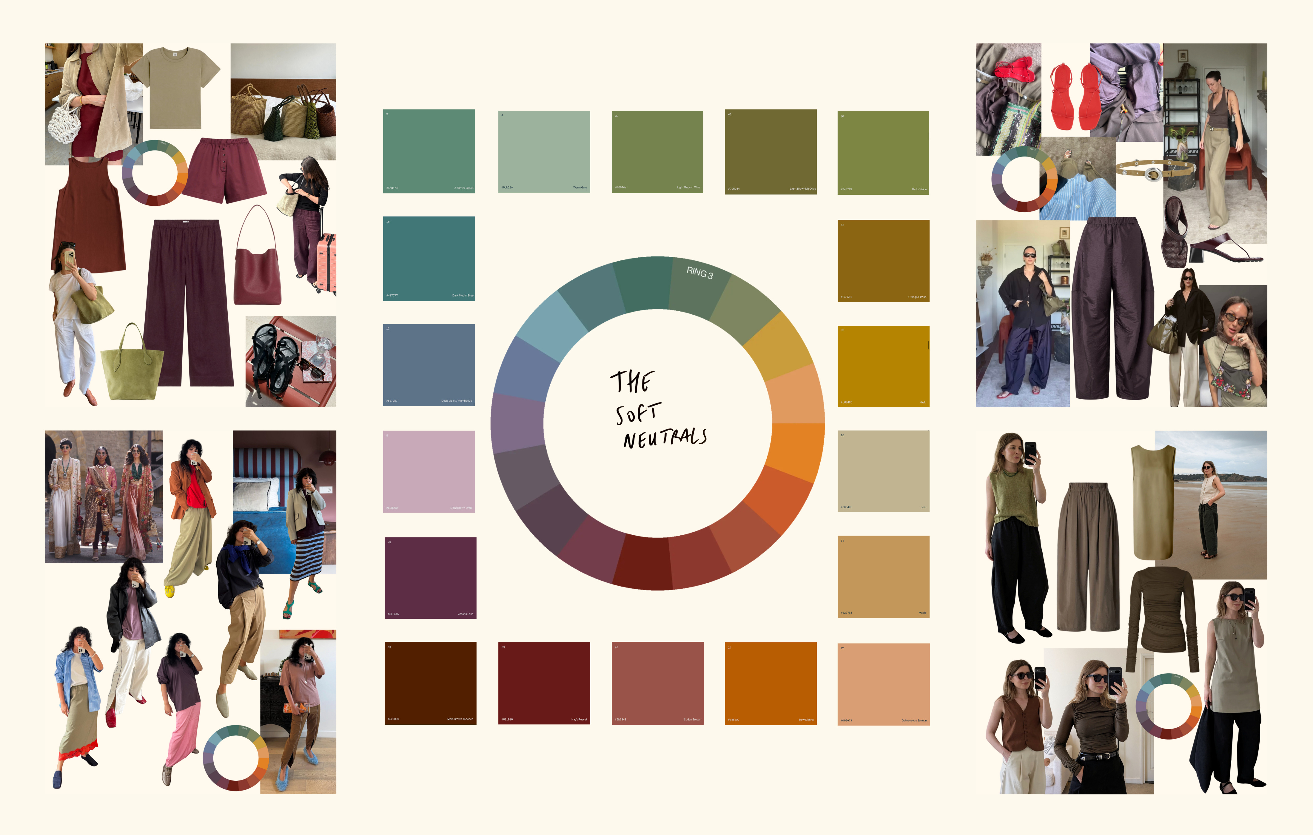
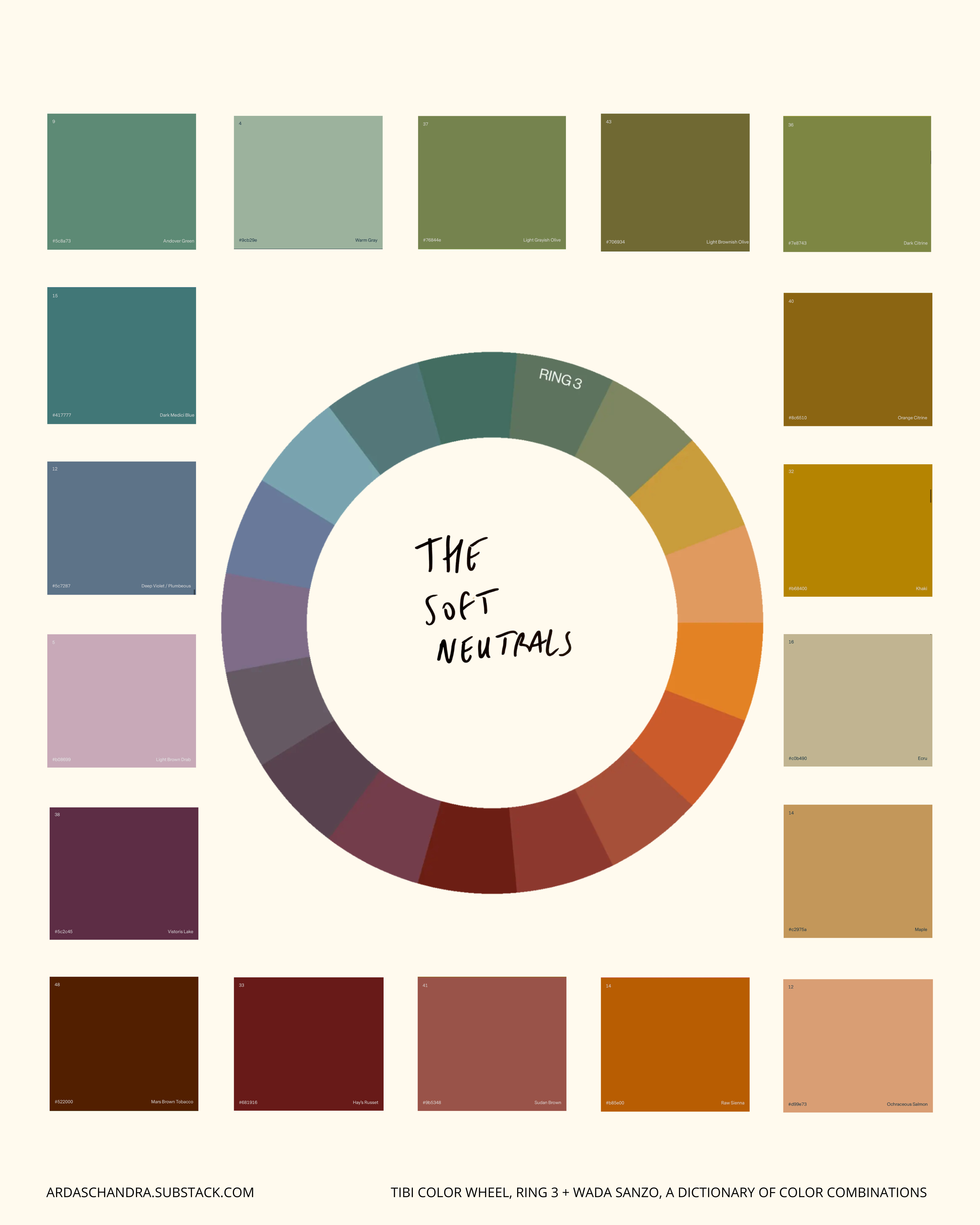
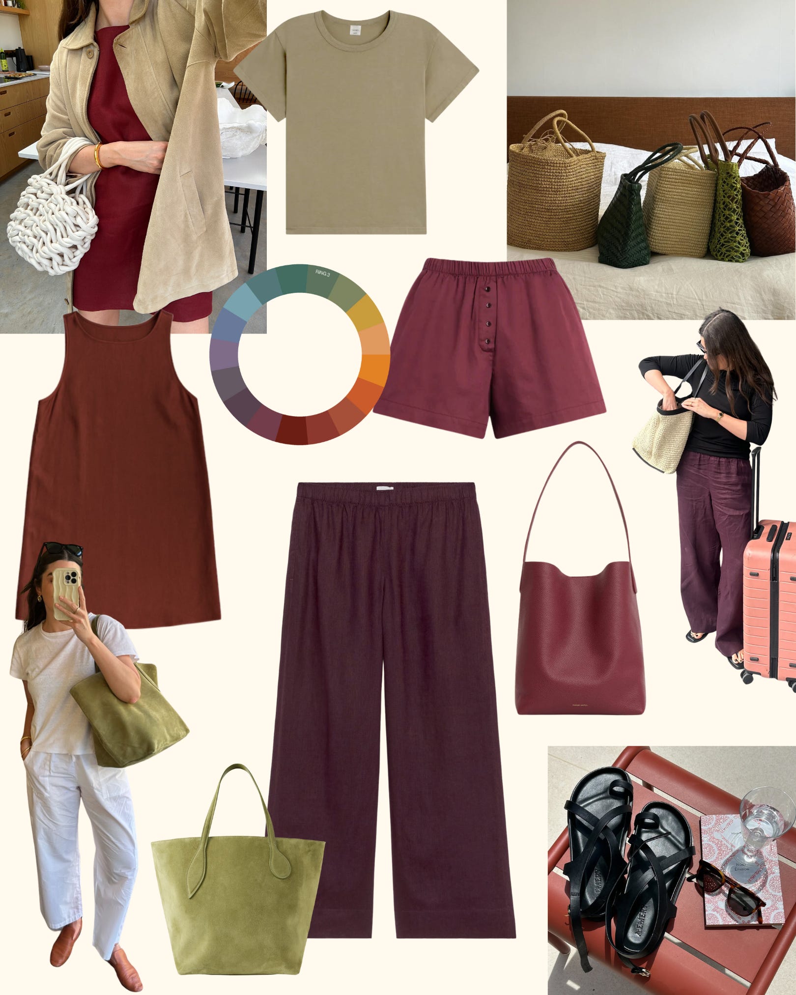
Let’s meet… the soft neutrals. The “no-color-colors”. The -ish colors. Shades that feel impossible to name cleanly (greenish, pinkish, brownish-grey, sage…). They’re layered, nuanced, and often pulled straight from the landscape: earthy, dusty, muddy, rusty.
→ Save this to your camera roll or take a screenshot—it’ll help when pulling pieces from your wardrobe or shopping:
Tibi, The Color Wheel, Ring 3 + Wada Sanzo, A Dictionary of Color Combinations (book/ I also recommend bookmarking the website and exploring the color combinations!)
Colors can be understood along three axes. I learned this from my father.
Hue: the color family itself (red, blue, green, etc.)
Clarity: how light, medium, or dark the shade appears
Purity: how clean and saturated the color is versus how muted or “dirtied” it feels
→ A muted color isn’t less colorful: it’s simply less pure, softened by the grey, brown, or red undertones it contains.
These Ring 3 colors (from the Tibi color wheel) create nuance. They bridge between true neutrals (Ring 2) and the obvious brights or pastels (Ring 4). They’re the colors that make an outfit feel calm, interesting, and expressive. More on the Color Math in Part Two, promise.
“Ring 3 is the missing link in most wardrobes. They are the least obvious choice, but they’re often the hues that bring everything together. They soften the edges of an overly classic vibe that an outfit made up of only Ring 2 can emit. They give creative confidence to a look.”
The soft muted neutrals are giving you more options to create a look that matches your mood, because they add depth, range, and nuance. Adding a few soft neutrals to your wardrobe will just give you more options to get more wear out of the pieces you already own.
Amy Smilovic puts it this way: “Ring 3, the new neutral you’ve never had but always needed”.
The invitation
Style, like intuition, is a muscle—this is gentle training. Once you finish this post, set a 20-minute timer and play in your wardrobe. Pull out those soft neutrals and start experimenting. See what you have, and what it can do for you. Full permission to take some inspiration from the wonderful creators who contributed to this post. And please, do take mirror selfies for reference. It helps to reflect on what works and what can be tweaked to feel more you.
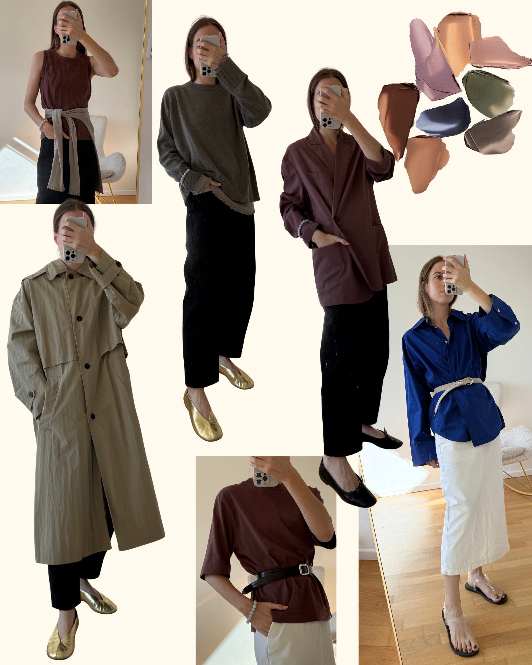
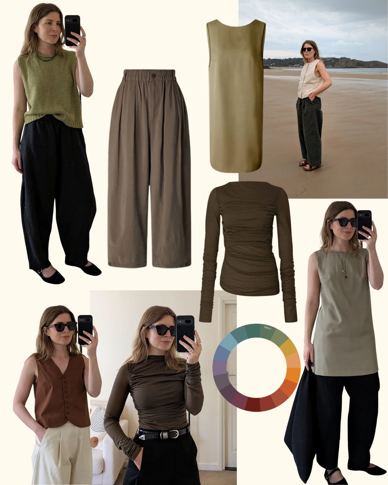
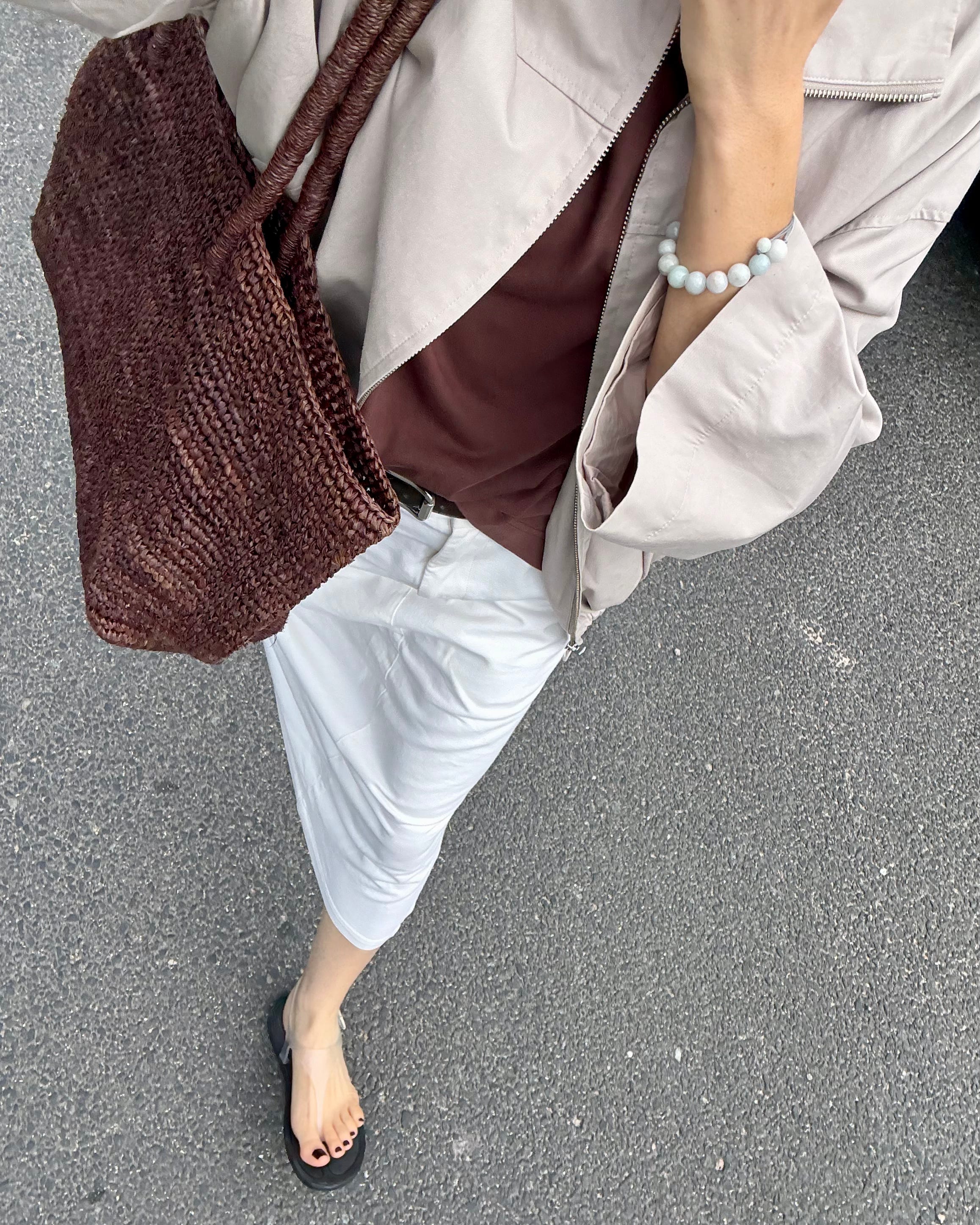
My comments: I love how the soft neutrals are calming the black trousers. I love a big piece of outerwear in a soft neutral color, like my nylon parka. Also, a detail such as a stone bracelet can bring so much interest. It’s subtle, but powerful. And do you see the belt over the cobalt blue shirt? It’s a ‘dirty’ ivory, I’d say. It’s suede, so it’s soft, and it reads a bit dusty, softening the bright blue. Now, try to name all of those tones. It’s hard, right? You know it’s a soft, muted neutral. Inspired by the MERIT eyeshadows
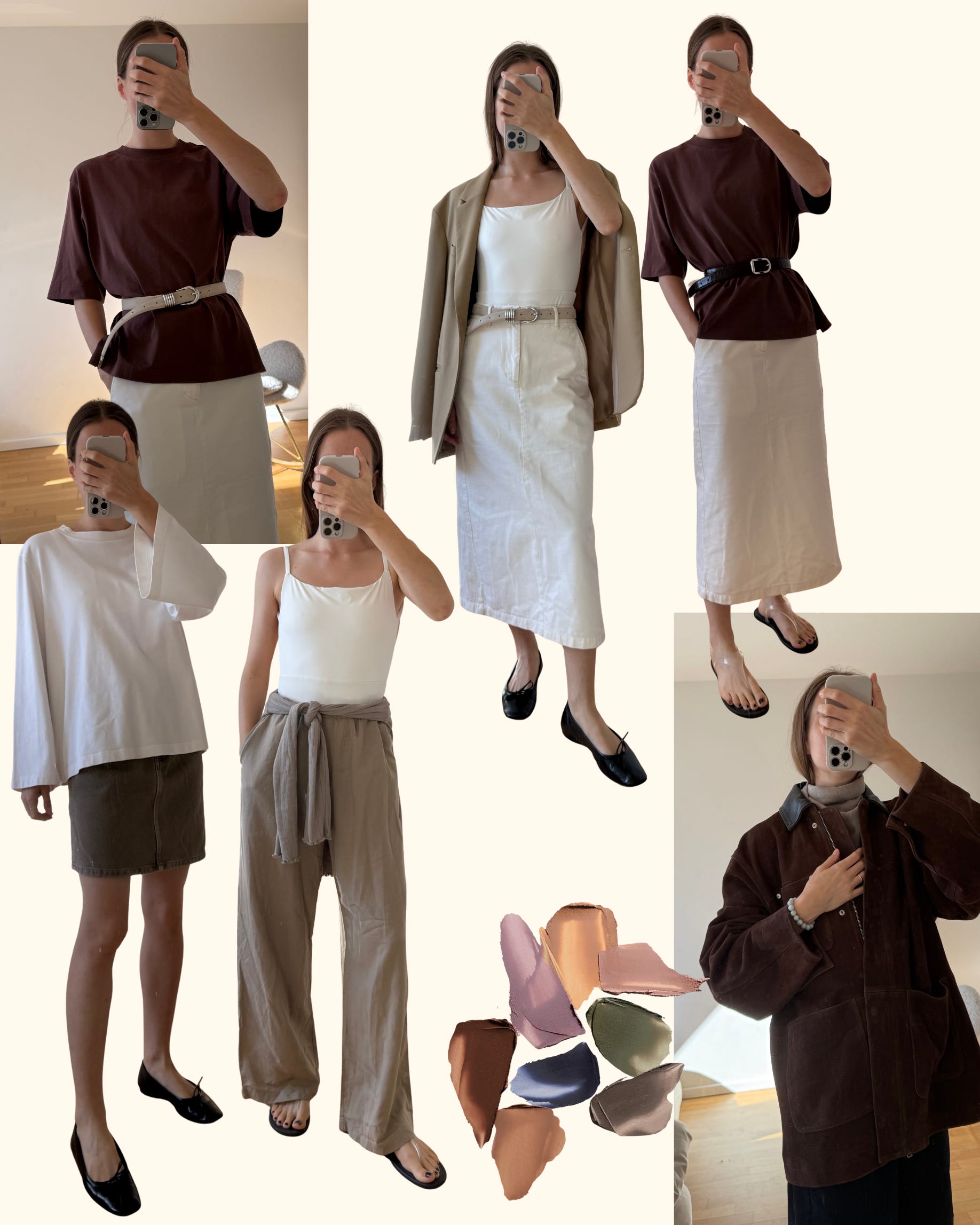
My comments: with white or ecru (Ring 2), the green-ish (of the skirt, of the trousers) color is just softening the vibe while grounding me. Also, can you see how the soft stone bracelet and the (illusion of a) scarf bring dimension to the suede jacket (back in stock in all sizes, by the way)? You don’t have to dress in soft, muted neutrals from head to toe - just a touch is enough. This post made me realize that IRL, my natural hair color is a Ring 3, hard to name, so maybe I’m “used” to those tones? Maybe it’s something worth paying attention.
The Creators, and why they reach for the soft, muted colors.
A note: I’m French, and torn between ‘color’ and ‘colour’… so when I quote UK creators, I use their spelling!
When I think of Anna and her style (“classic, polished, undone” are her style words), I think of clean classic neutrals, animal print touches, interesting textures (especially in bags, jackets, and shoes), and intriguing Ring 3 -ish colours. This is what she said:
"I’m still finding my way with Ring 3 colours. After years of wearing mostly black and core Ring 2 neutrals, I’ve only started experimenting with those rich, deep, muted tones in the past year. They currently don’t take up a huge amount of space in my wardrobe. Right now, they make up maybe 5% of my wardrobe —it’s a work in progress— but one of my main goals this year is to invest in more. Whenever I do, they add instant versatility and depth, and they’re surprisingly easy to style. My favourite tone is a rusty brown-red - I have this Reformation Jessi Linen Dress, and every time I wear it, it just makes me feel good. I usually pair it with Ring 2 colours (white, off-white, navy, grey, brown) fora clean and chill look.”
I ask Angharad for her point of view because I appreciate the silhouettes she can create with neutrals and slouchy, oversized fits — without compromising on gentle feminine touches. I saw her recommending those soft neutrals quite often… So, that’s what she said:
"I wear a lot of black, navy, white, and grey. Bright colours aren’t really me, so when I want something different, something calmer and softer, I reach for muted, earthy shades. I especially love my khaki and olive trousers. At this point, they feel almost like neutrals because they pair with everything. In summer, I like them with off-white or ecru for a fresh look. Navy tops work beautifully too with those soft neutrals, especially with a white T-shirt or silk scarf layered underneath to break up the outfit.”
from Fit Happens: “the cheat code for effortless color pairing”
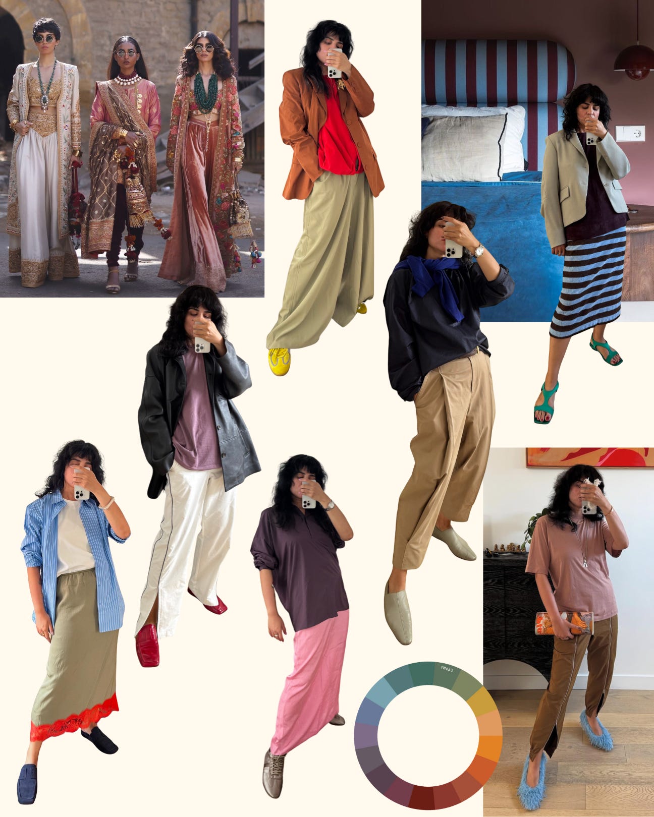
I had to ask Asta because she is very fluent in Tibi(sh?) and she just has a gift to teach others about silhouettes, lines, colors, and friction formula… Her style words: “chill, modern, commanding”, are her throughline, and here is what she said about those -ish colors:
"Ring 3 colors have always pulled me in—and it’s cultural as much as personal. When people picture India, they think of bright colors. True, but if you look closer at Indian design and fashion, you’ll also see Ring 3 everywhere, like a deep undercurrent of Ring 3 tones: those muddy, in-between shades that are hard to name. They’re layered with black, white, and bursts of Ring 4 brightness, creating that rich, nuanced color story.
As a (graphic) designer, I’ve always gravitated toward Ring 3. It was my go-to in design work, so it’s no surprise that once I started caring about how I dressed, those colors came with me. I even checked my Indyx tags (yes, I tag by color ring), and Ring 3 makes up a solid 25% of my closet. No wonder, it’s one of the most useful categories I own.
To me, Ring 3 is the cheat code for effortless color pairing. On their own, these shades are calm and grounded. Paired with Ring 4s (the brights and pastels), they tame the energy and make it feel intentional. They’re the perfect buffer between extremes, like bright red and stark white. They soften contrast, guide the eye, and add dimension."
My notes here: Do you see how playful and creative getting dressed can be? I hope you do! This is a one-stop masterclass on wearing those soft muted colors with classic neutrals (navy, grey, white, brown) and the brights and pastels (Ring 4). The Ring 3 is adding dimension and depth, so it makes the whole look interesting. It’s a bridge, it’s a connector, and it’s worth investing in good quality pieces. If you need to know where something is from, ask Asta (90% chance she will answer ‘it’s Tibi’) — credits Asta
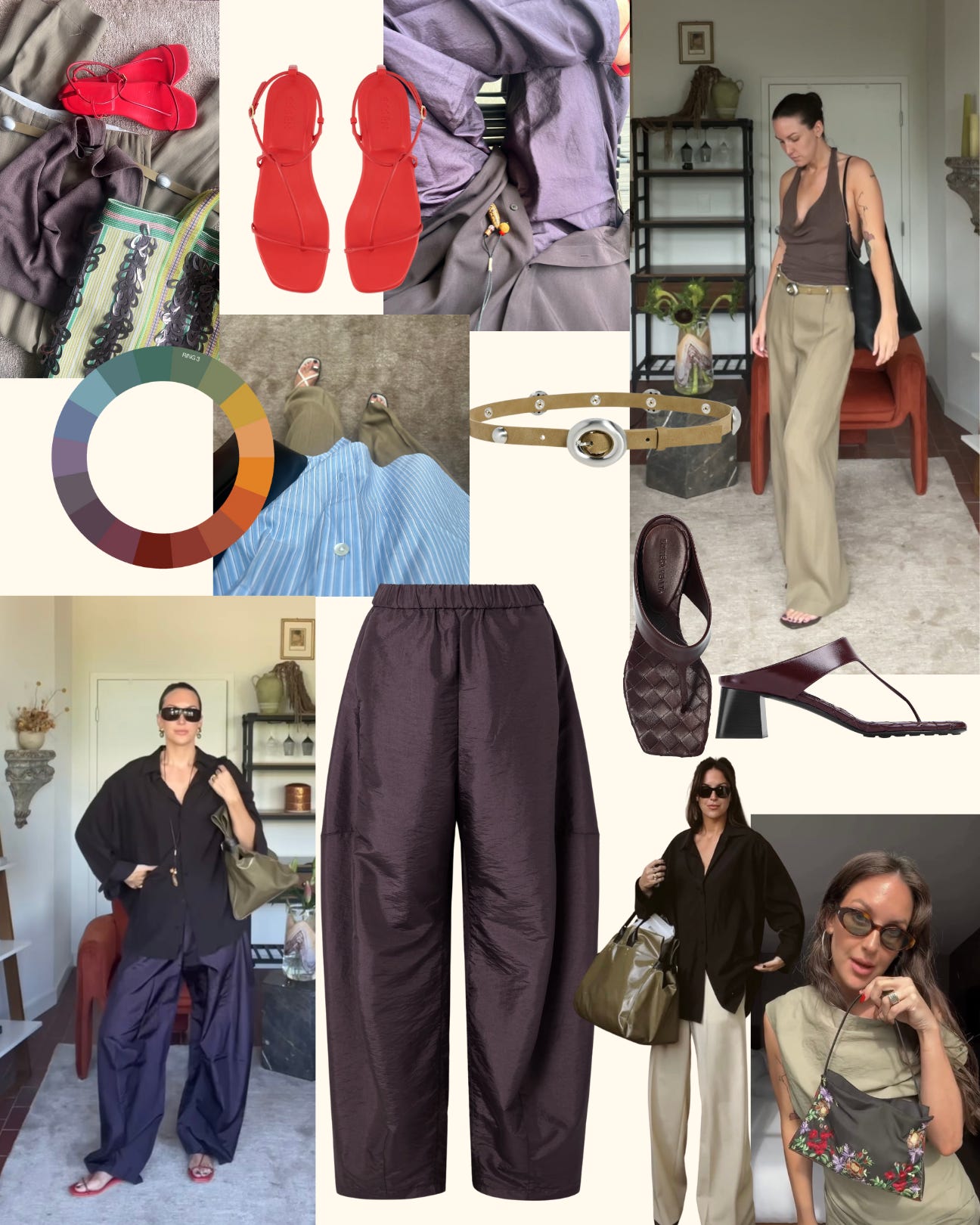
When Anna Baldwin shared that she felt so much better wearing rich, deep, interesting colors than just head-to-toe black, I thought: yes, me too! She has been delivering visually insightful styling on TikTok, and that’s why I asked her to tell us more about her relationship to the soft, muted, rich Ring 3 colors. She is “definitely chill, modern, classic”, and bold might be her special adjective (modifier) (she loves a sharp sunnie to feel truly herself)! This is what she said:
"My creativity met its match with the introduction of Ring 3 items to my wardrobe. Before that, I focused on black as my wardrobe hero, which kept me limited to Ring 1 and 2 outfits. I don’t love high-contrast looks outside of black & white, so my pairings were restricted. Ring 3 evokes approachable contrast – attention-grabbing but easy.
My first Ring 3 expander was a pair of Acne Studios trousers from Another Nue in Copenhagen. The color, a calm blend of sage green and tan, immediately paired well with my vibrant red sandals – a combination I never reached for with black trousers. These trousers became a gateway to more Ring 4 color combinations. Now, I have a handful of Ring 3 pieces in each category – trousers, tops, shoes, belts, and bags. Another wardrobe expander for me has been pieces in the burgundy, plum, and maroon family. The red undertones bring a richness I didn’t realize was possible. I love pairing them with brown, red, lavender, and blue to sharpen the look.
You can experiment with those soft neutrals if…
You want more color, but neutrals and saturated hues feel too stark
You like minimal style but want more interest
You love natural color pairings (floral, landscapes) but struggle to translate that to style – Ring 3 mirrors nature’s contrasts, like sage green grass against bright blue skies. Start saving nature photos for inspiration!"
My notes here: the soft neutrals are making the vibe even more powerful. Soft power, and I can see why “bold” is a key style word for Anna. There is something unexpected in the play of proportions and colors. You can see that texture and having a certain modernity built-in the garment or accessory is key for her. A few of her favorite: Apparis belt (“a layer of interest”) || Essen red sandals (a true ring 4) || Bottega Veneta heels (“more unexpected than black”) || Tibi crispy nylon winslow (here on NAP, set an alert?) (“the missing link to look lush & serene” || credits — Anna Baldwin
“Ring 3 is the superhero that fixes many broken closets. It’s the color that’s least often represented and the hardest to find in stores and online, so the dearth of it in your closet is no wonder.”
Don’t worry, I’m here to help you. I have a very good Ring 3 soft neutrals radar, and I’ve put together a selection of pieces that would become the connectors in your wardrobe, or as Anna Baldwin put it, the “expanders”. And believe me, it doesn’t mean you need a new wardrobe, just a commitment, like Anna Newton, to invest in those soft, muted neutrals as a priority, picking this hard-to-name color over black or white next time you make a purchase.
So, in Part Two, coming up next, I’ll share with you essential styling tips with soft neutrals, how to mix colors across the Color Wheel with intention, my favorite brands for soft, muted, Ring 3 tones, and my shopping picks to add depth and versatility to your wardrobe. So, definitely come back and stay subscribed for more ideas to refine your style.
If this inspired you, please share, like, comment, or restack. It really helps visibility!


Thank you for this post. I’m wondering if you can tell us the brand of your jacket and skirt in the last photo?
This was a feast for the eyes!! Loved & saved.