This letter answers these questions: “Where do the “bright color moments” live in quiet places?” and “What can we learn from a micro-trend tied to a specific place and location?”
You see, Hamburg’s village zone is quite different from the city center.
It’s slow-paced. It’s private. Everyone minds their own business. It’s grounded. Lots of nature and deep seasonal cues, the wardrobe shifts meaningfully with the landscape. It’s low-friction living, it’s safe. There is ease and simplicity. You walk to get bread, Langenstangen, and Franzbrötchen. You walk to drop off a parcel or to the organic store. It’s peaceful. You see moms riding their cargo e-bike to the kita. You say ‘Moin!’ with a polite smile. People look after their garden like their lives depend on it, and the cars are always sparkly clean. The vibe is charming, infused with German discipline. Herr und Frau Practical Pragmatist, if you will.
Summer isn’t tropical, but it’s long-lighted, slightly cool, and you always carry an extra just-in-case layer with you (learn to read the clouds!). The backdrop, in Summer, is made of 50 shades of green-ish (the trees and bushes), red bricks (or crisp white) houses, and slate gray roofs. It’s quite predictable, but Hamburg has a nautical theme to it, navy is the new black here, and Breton stripes are as common as having an Umlaut in your last name. In general, the idea that being practical and pragmatic — comfort over style — is paramount.
And yet. In a hushed palette of grounded greens, navies, and brick tones, I spotted a micro-trend.
My theory is that the Farmers’ Market collectively and subconsciously functions as an injection of energy and color in people’s weekly routine. Twice a week, on Thursday and Saturday mornings, the center of the village brightens up… A micro-sizzle vibe, if you will (without the nightlife, obviously). (If you need a vibe decoder, check out this post by
You’ll see that those looks I documented would make no sense if I’d have used that “remove background” option. With an abundance of fresh products, seasonal fruits and vegetables, bright flowers, and the market stalls and trucks, the background is screaming “Energy!” and people, naturally, match the vibe… If you’ve ever seen the Tibi color wheel that divides tones into earthy-muddies (Ring 3), obvious neutrals (Ring 2), graphic black (Ring 1), and clear brights and pastels (Ring 4), you’ll recognize what’s happening here. Most of the village lives in those grounded greens and navies (Rings 3 + 2), but the market invites a flash of Ring 4: unapologetically bright, clear, seasonal colors. And when it’s well executed, you’ll notice that the people are “fitting in without blending in”. They caught my attention because they brought friction or contrast in their outfits. Twice a week, Herr und Frau Practical Pragmatic become Herr und Frau Creative Pragmatist.
What you’ll get today:
3 Style Edits featuring pieces that are either on my mind, in my wardrobe, or in my cart
a ton of street style photos I took at the local farmers’ market, along with my styling observations
an invitation to train your styling eye: to notice what works, and what could work even better!
It’s gonna be a lot of pictures, so open this letter in your Substack app or browser or save it for later!
A visual diary, capturing real people. With my comments in the captions.
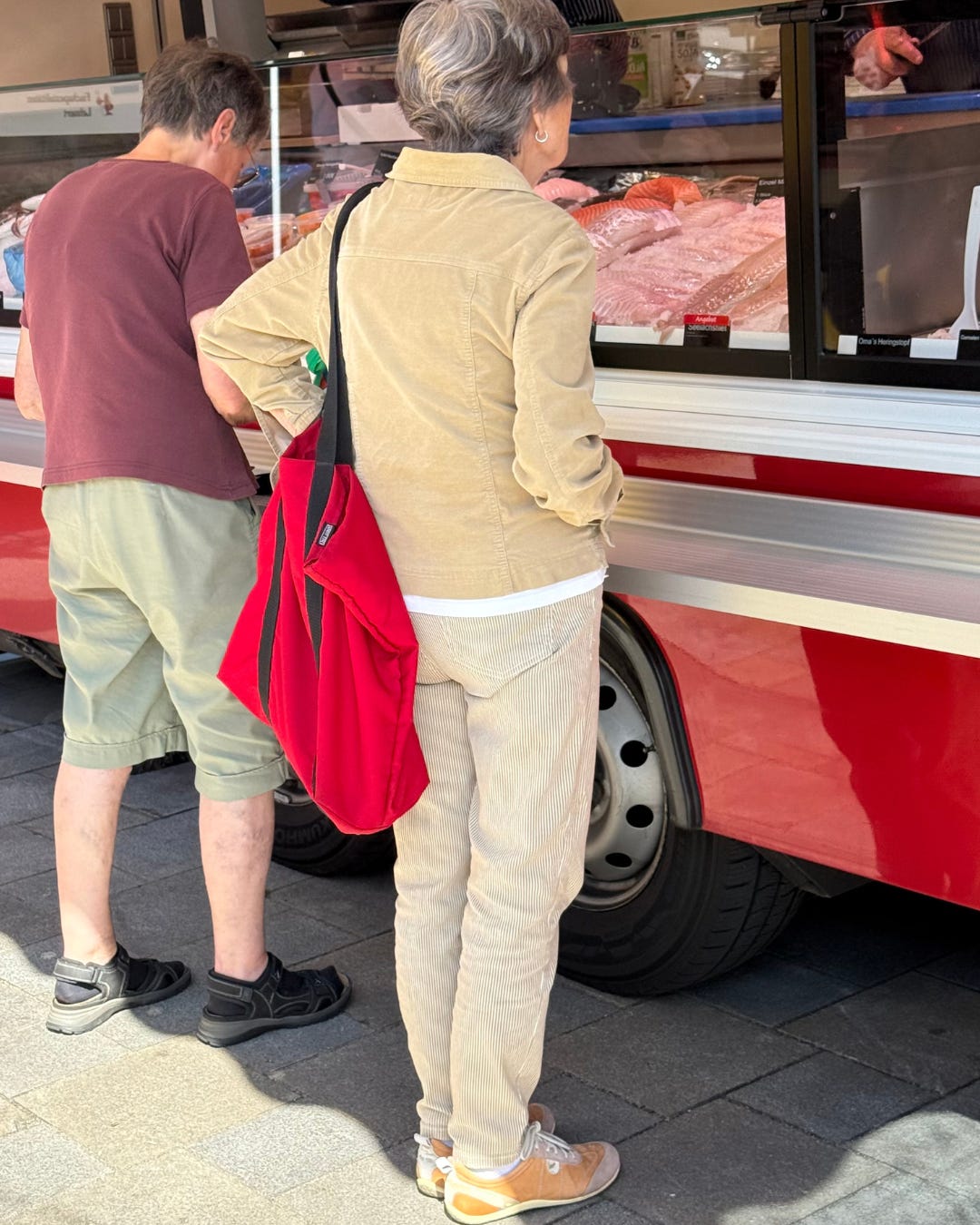
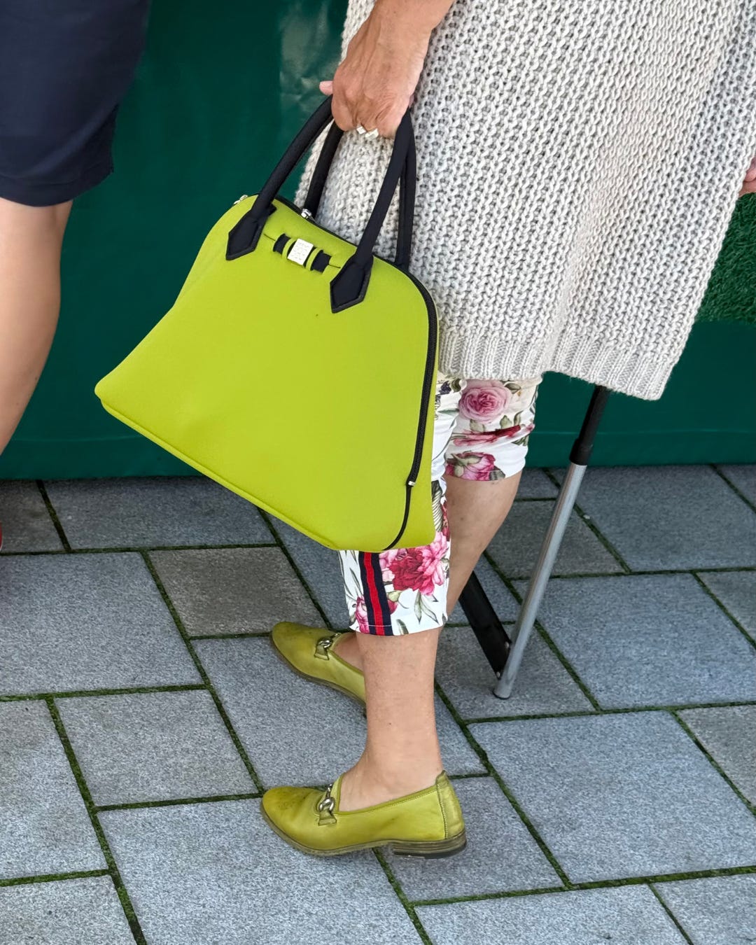
On the left: socks and sandals are still a thing in Germany. But also mixing Ring 3 colors (plumish and sage, soothing) with the black shoes (edgy). On the right: shades of beige and camel (ring 2 + 3), with a pop of red (the bag, ring 4) for energy (I wish the bag would not have the black though), and who noticed the white t-shirt popping out, creating a new line?
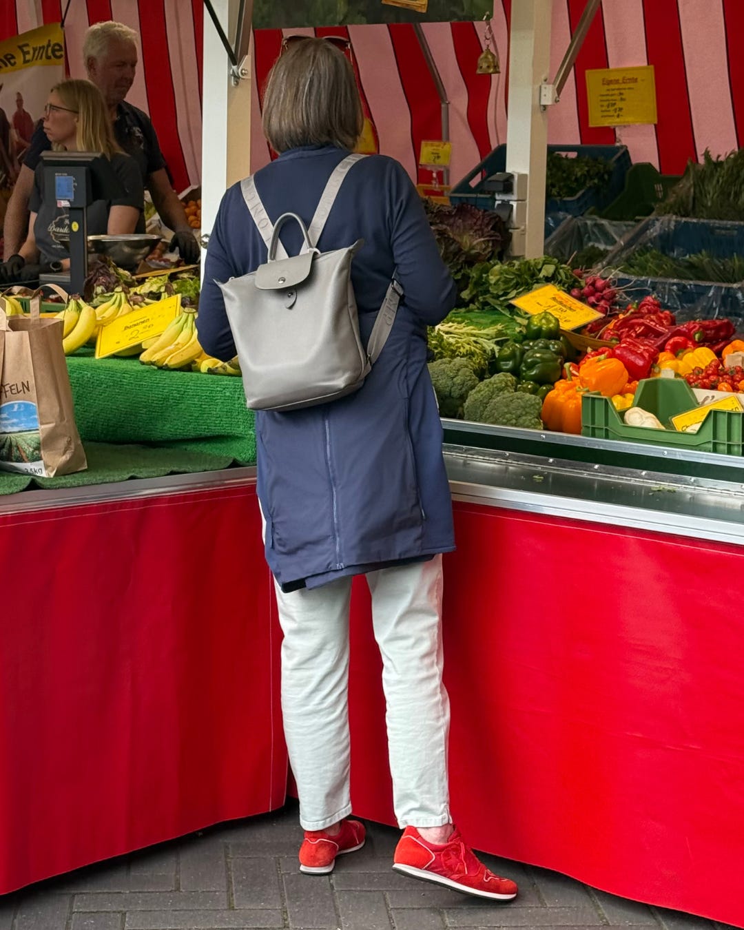
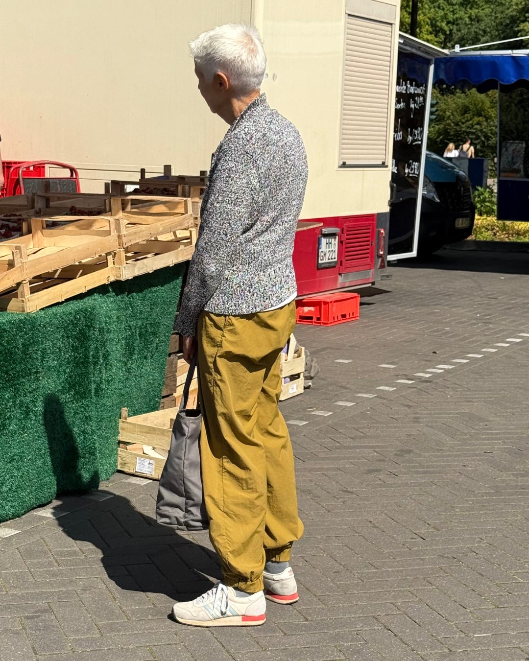
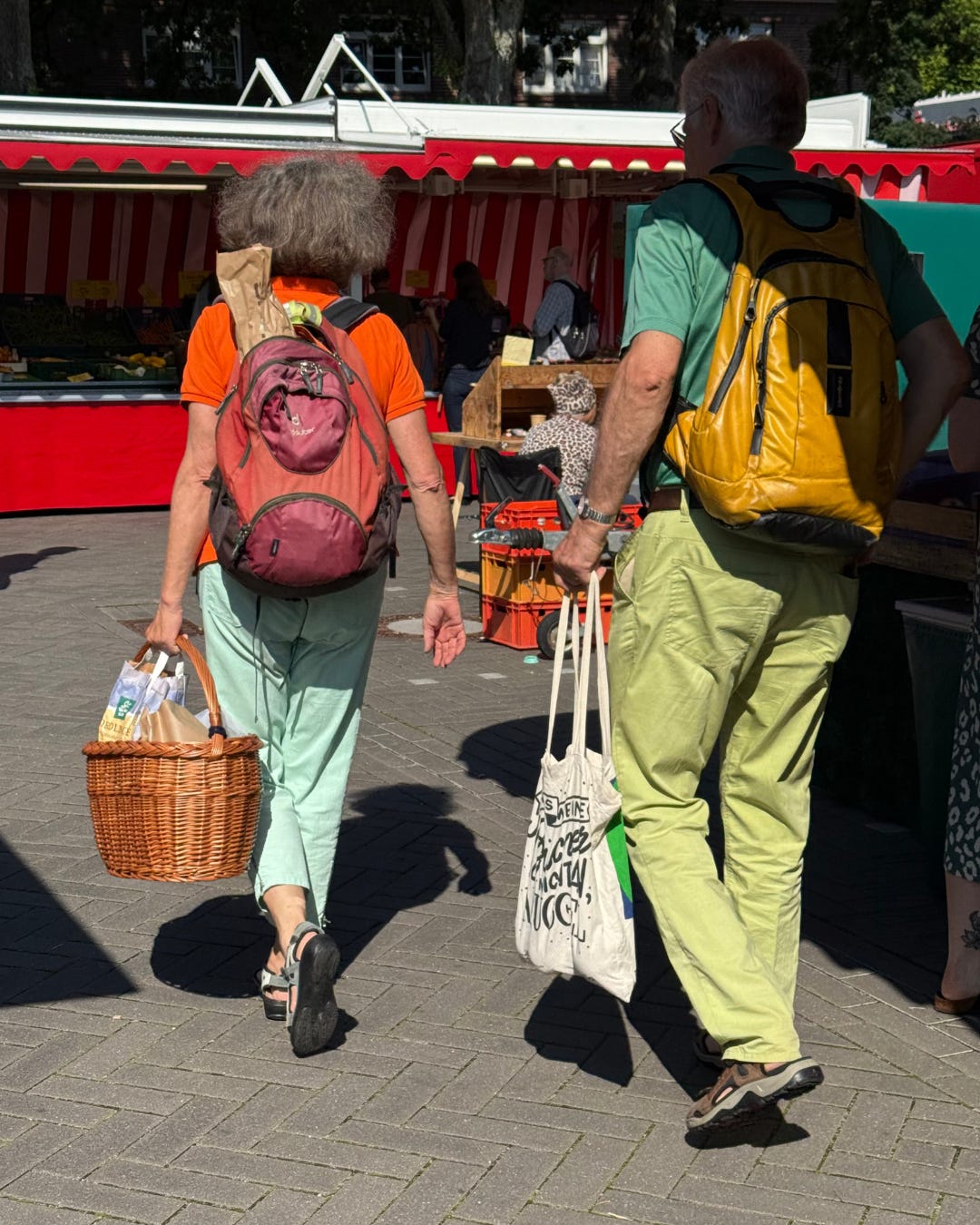
Ring 2 neutrals (navy and light grey and medium grey) with pop of red again in the sneakers (from a German brand), note the jacket around the waist, very pragmatic. I would wear the leather Longchamp backpack with irony (I would not use the straps on my shoulders). Oh and we see a tiny bit of skin showing at the ankle (better than nothing!)
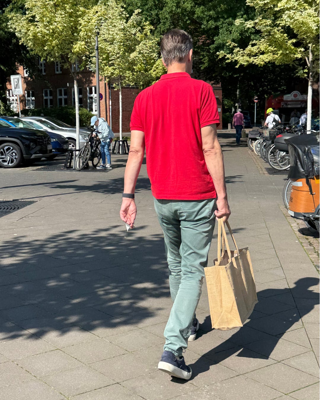
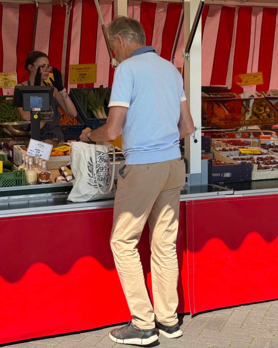
Notice the backdrop, the bricks. Pop of red, again, in a very classic polo, with ring 3 trousers (try to name this color?), and neutrals navy and white (nautical theme) sneakers, and big tote bag gives a raw, natural vibe. I actually like this color palette.
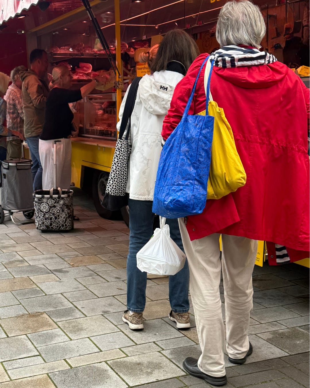
Primary colors, red, blue, yellow, some stripes details, lot of energy on the top half, and grounding on the bottom half (the neutral beige and black hard shoes giving edge). I see friction, but without connection here?
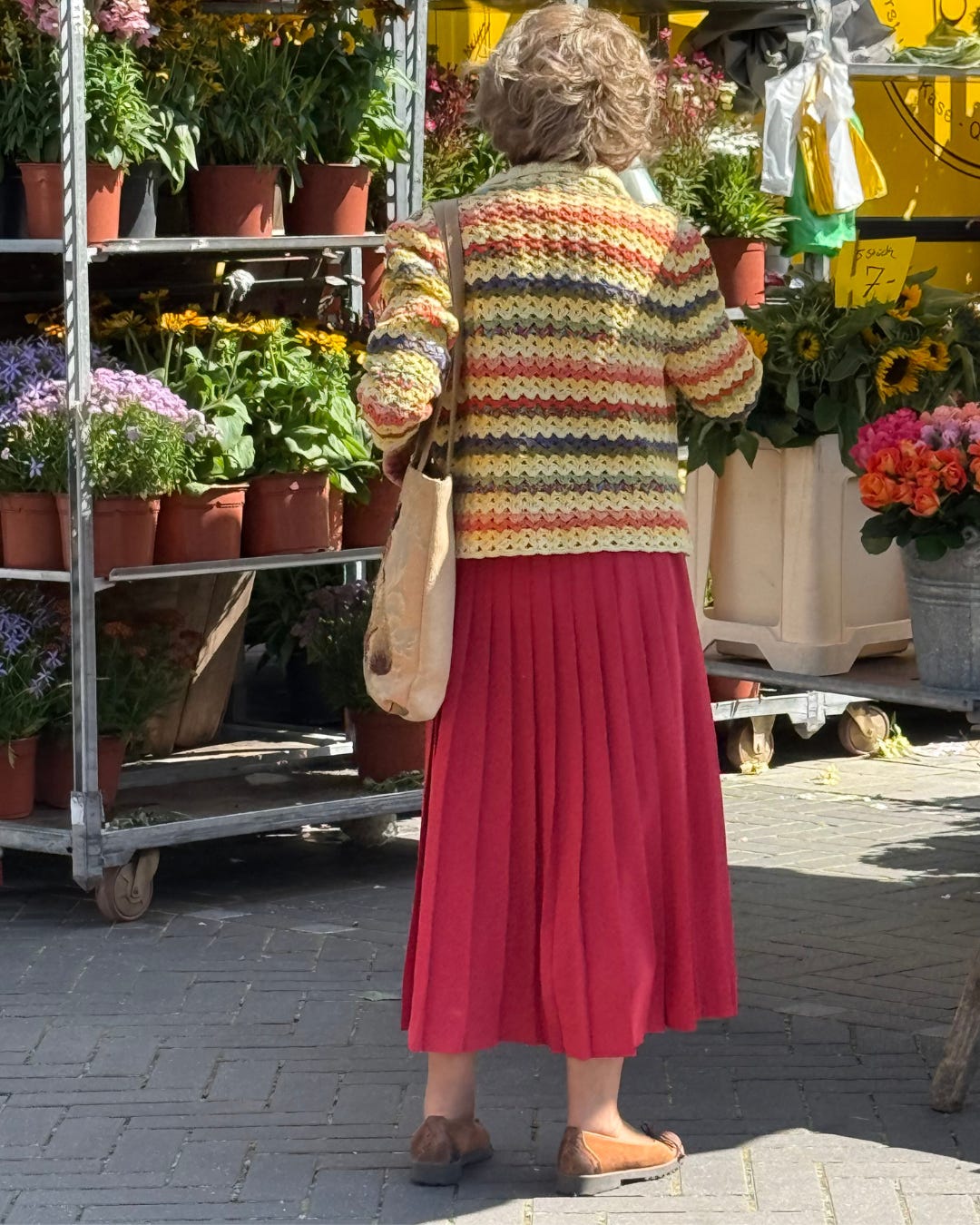
Matching the flowers, lots of colors, and a mix of lines (vertical in the draping of the skirt, and wavy horizontal in the cardigan), grounding brown shoes, I like the butter yellow in the cardigan and imagine if the skirt would be a white Tibi pleated nylon skirt instead? that would be good friction
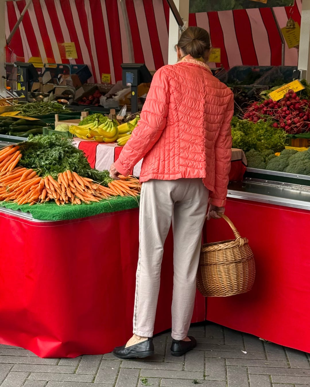
I love the basket, the light puff jacket is very practical but in a creative salmon color, bringing some energy to the neutral greige and black shoes, and I can appreciate a bit of skin showing on the feet, it’s giving breathing room for our eyes!
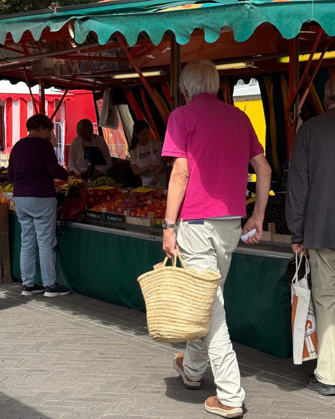
The basket in one hand, the groceries list on the other hand, see how the fuschia polo is giving energy and fun (I can spot a white layer under it, pragmatic!)
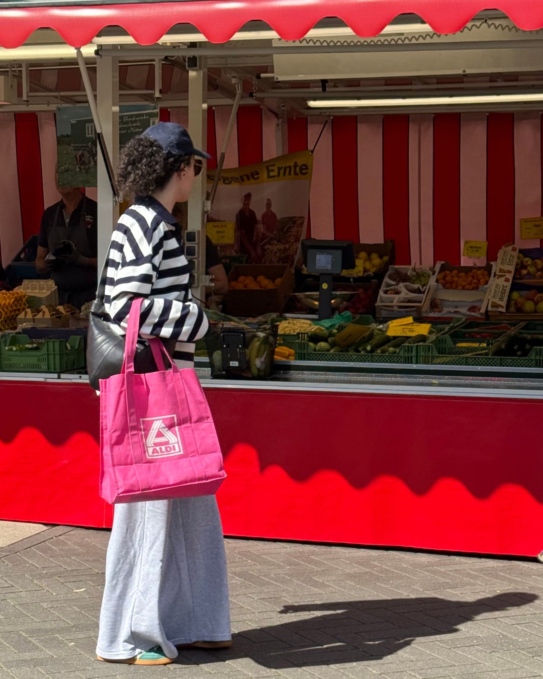
The pop of color can just be the supermarket tote, I love the irony of the supermaket bag with the Lemaire croissant bag - talking about mixing high and low. Here we see some interesting lines (the diagonal line of the crossbody bag on the printed lines of the shirt) and proportions (but I’d roll up the sleeves to show some skin)
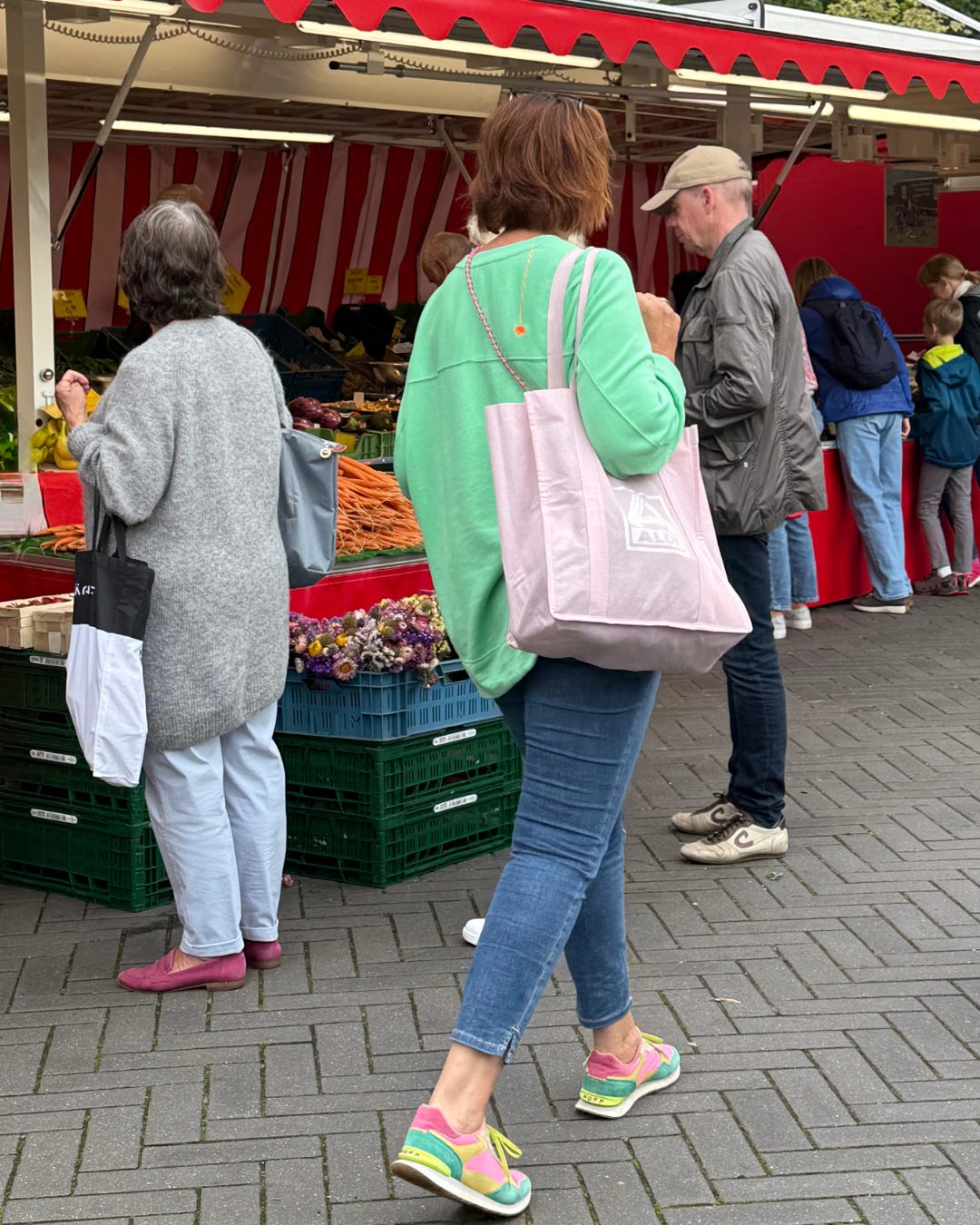
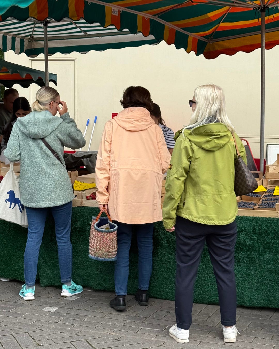
See, the supermarket tote again? It seems to be a collectible! I appreciate the color story between the bright mint and soft pink, and you can see it’s a story that comes back in the sneakers, which can be annoying for our eyes because we can’t settle on one point..
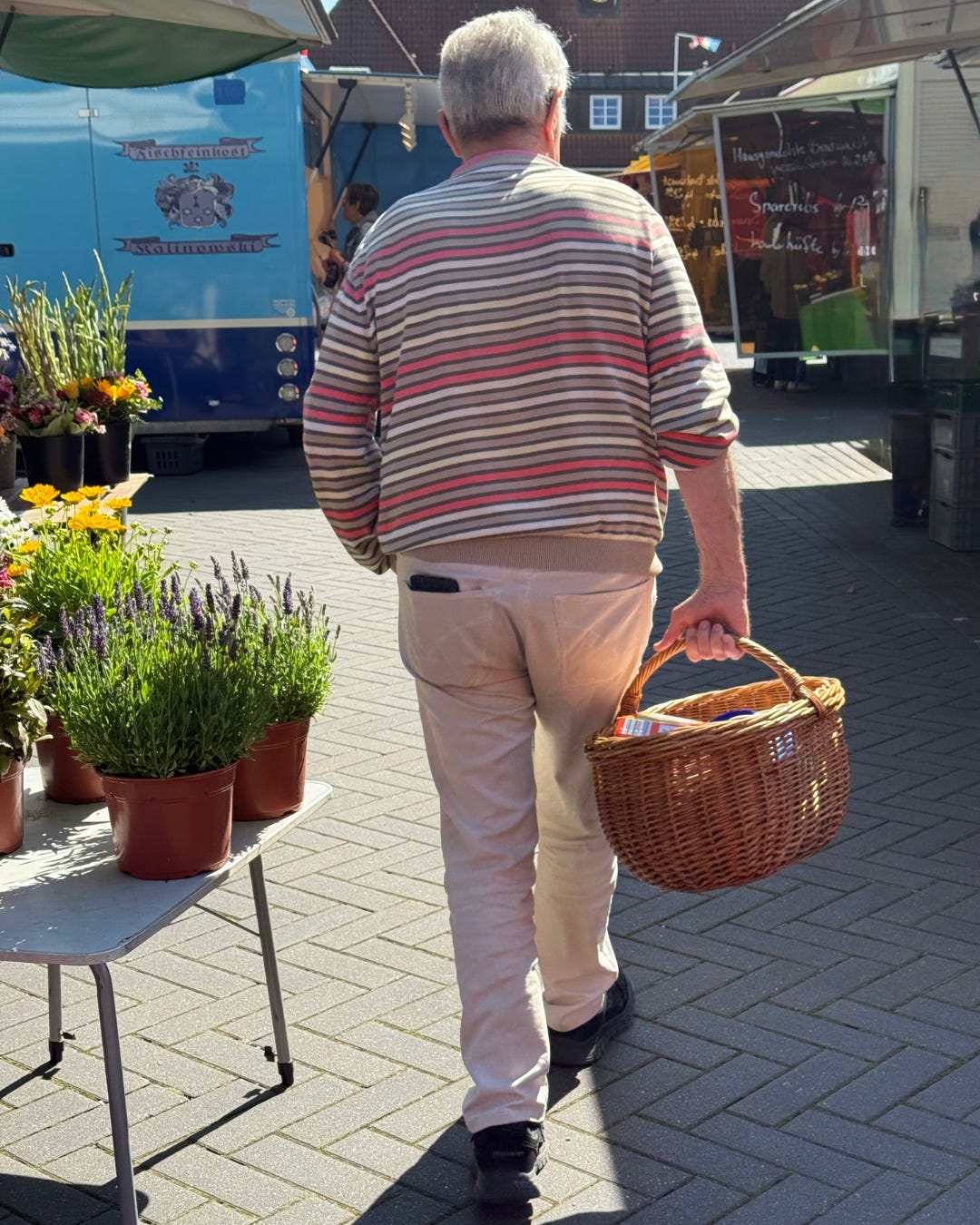
The basket, so cool and classic, and an appreciation for the take on stripes, with a pink infusion, in a rather classic outfit
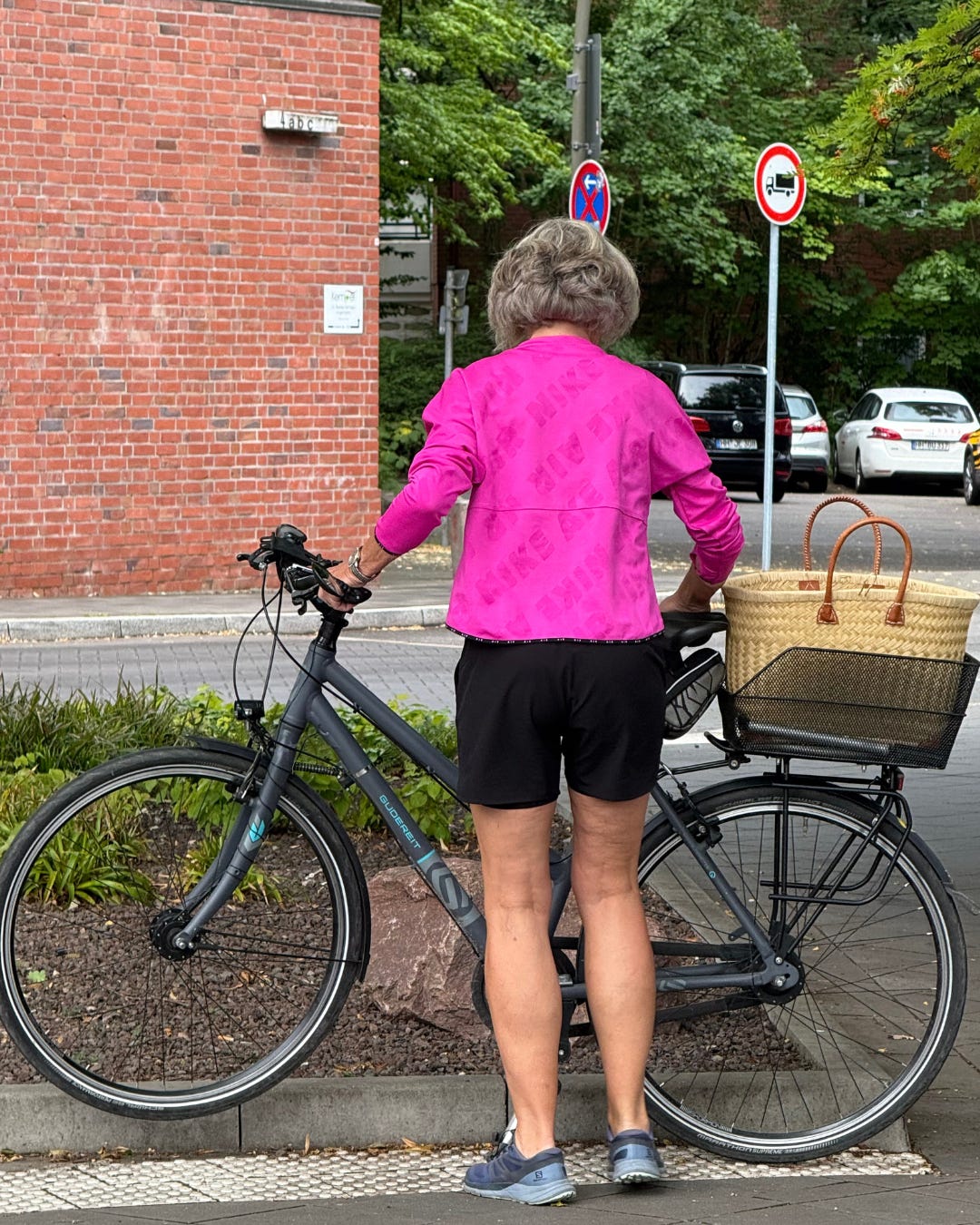
Notice the backdrop, bricks and shades of green. And then, the fushia! The further away the colors in the color wheel, the more contrast and drama, see the intense contrast between the true black and the true fushia? It’s a sporty outfit, right, but see how the basket (with the leather handles!) is bringing the colors together?
Bright yellow on a sunny day, I saw him again on a rainy day wearing the same top, but blue denim, I’m assuming he was matching the energy of the moment on both occasions - I can see the whole person there, it works, no?
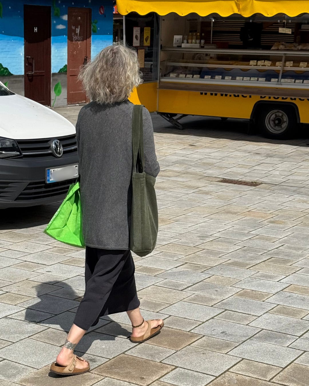
Love the sporty nylon in a strange color, it gave me Tibi vibes, it’s soothing while making the neutrals (grey) more interesting, and it’s practical.
The jackets: an appreciation for the -ish colors (try to name those colors!) mixed with neutrals, on the left, it’s a bit too matchy with the turquoise Nike and it’s not settling, but the one in the middle is such a good one because I see the jacket and the bag with all the -ish colors, and the one in the right, I like the crisp feeling that the white sneakers bring
All the colors, and very pragmatic footwear, that’s a ton, a lot is going on, right?
A great balance of big, slim, skin! I love the elongating cardigan with the slip skirt, and the pop of bright green balanced with the neutral beige birkenstocks (giving barely there sandals)
I always say: don’t match your shoes and your bag, because the eyes can’t quite settle. And it feels too matchy-matchy, you see?
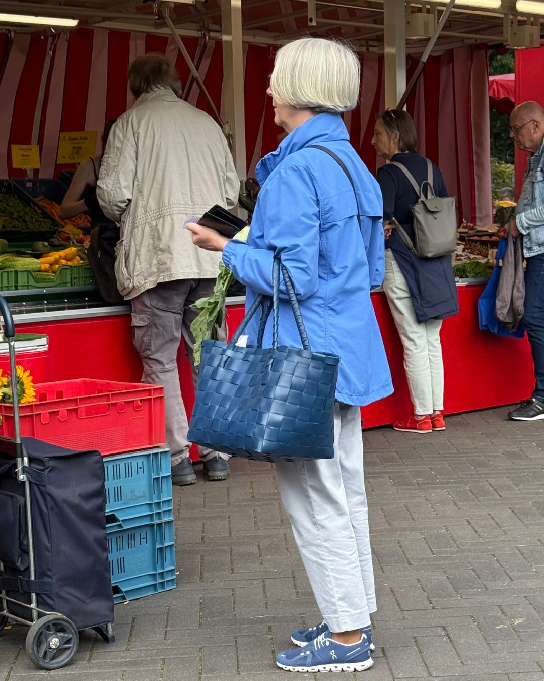
Enter the 50 shades of blue, it’s practical, and it’s infused with the pop of bright colors matching the market vibe.
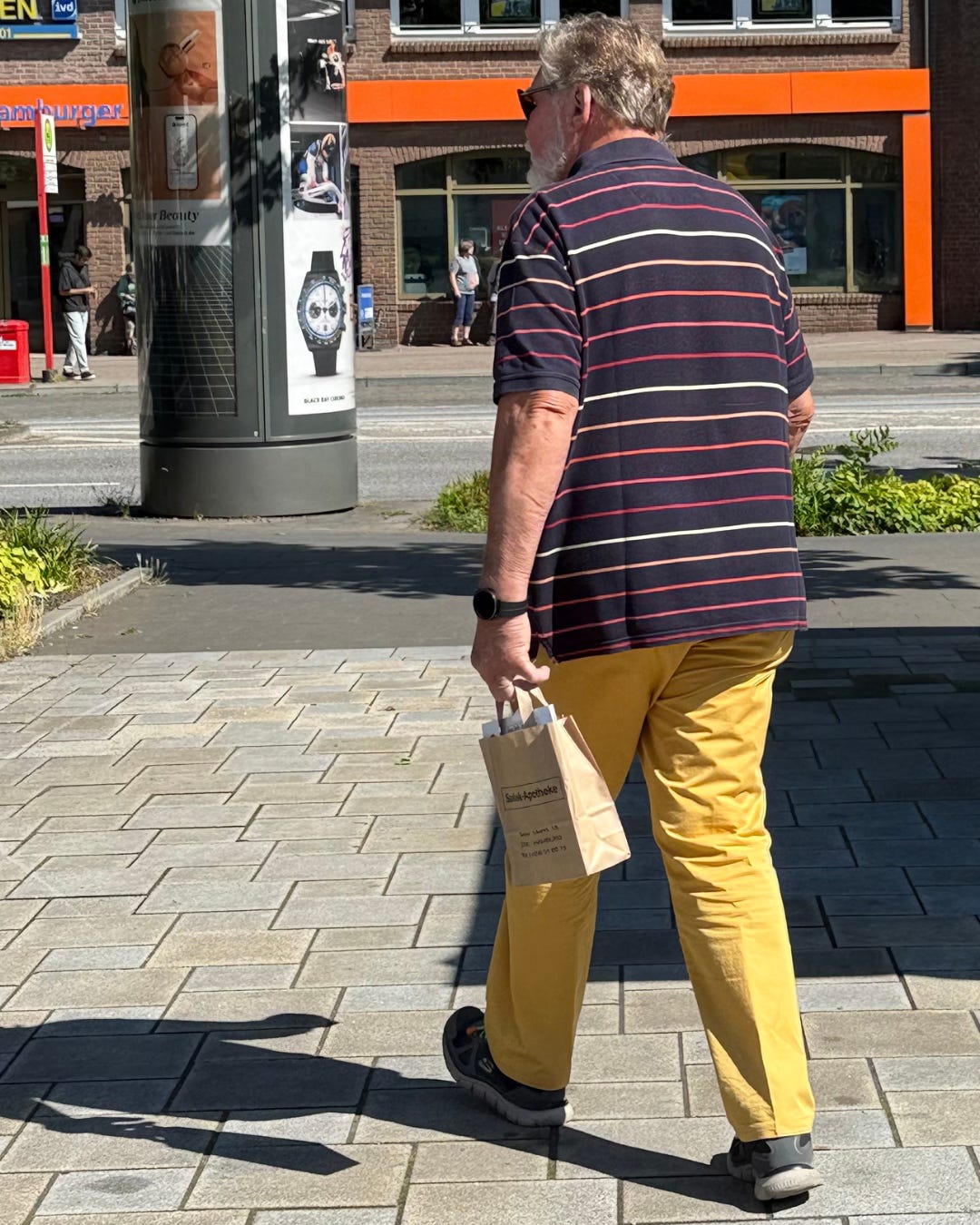
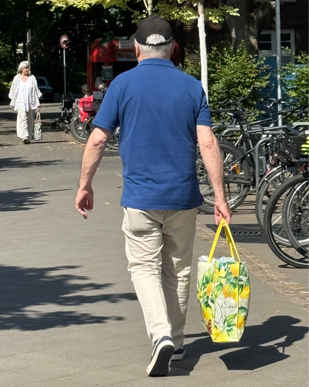
The market bag - literally lemon yellow brightens up all the classics (a polo shirt and chinos)! Think about it next time you feel too one dimensional.
Baby blue + beige, it’s classic, and I appreciate the lighter colors, it has a Summer vibe (and remember, it’s not tropical here!). It goes well with the backdrop.
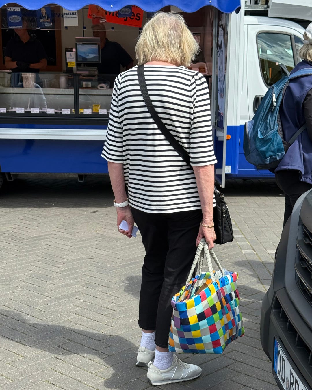
It’s a black and white story with a colorful bag. Lots of lines: a diagonal (the crossbody black bag) on the horizontal lines. But also, a skin line between the cropped trousers and the socks, and we want to avoid a skin sandwich (it would have been better with full length black trousers, IMO)
Like this post if you appreciate this vibe! Or if you like dogs. It helps the publication more than you can imagine!
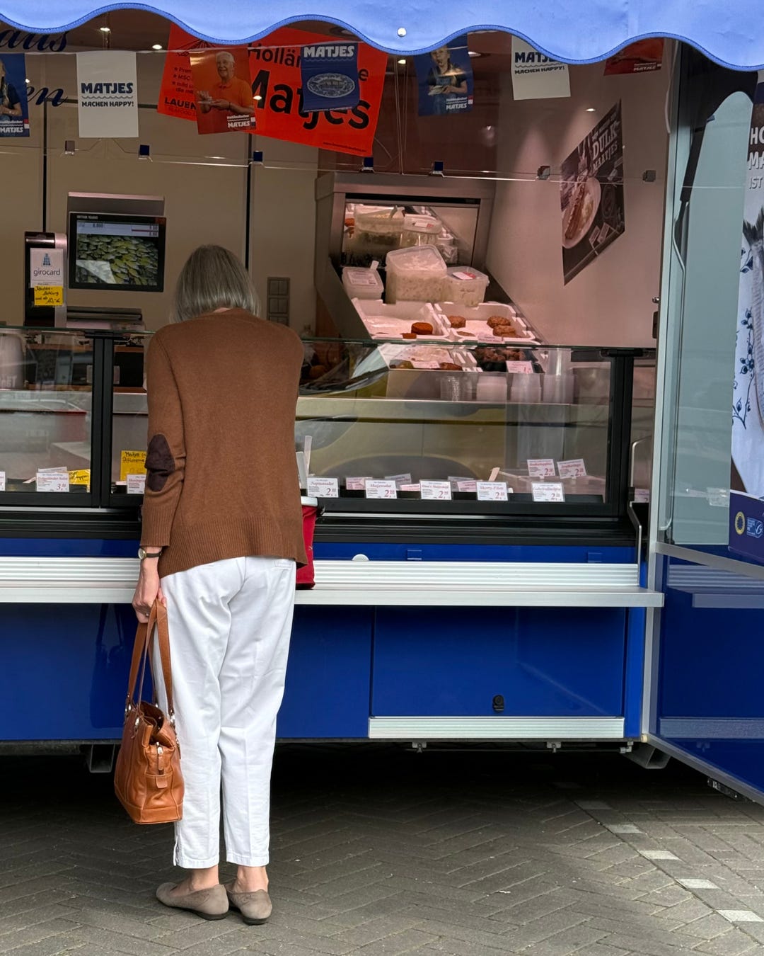
A more classic story (grounded in ring 2 neutrals, white and brown), but you see cropped trousers done right, with a taupe ballet flats showing some skin. The only crisp white trousers I noticed, actually.
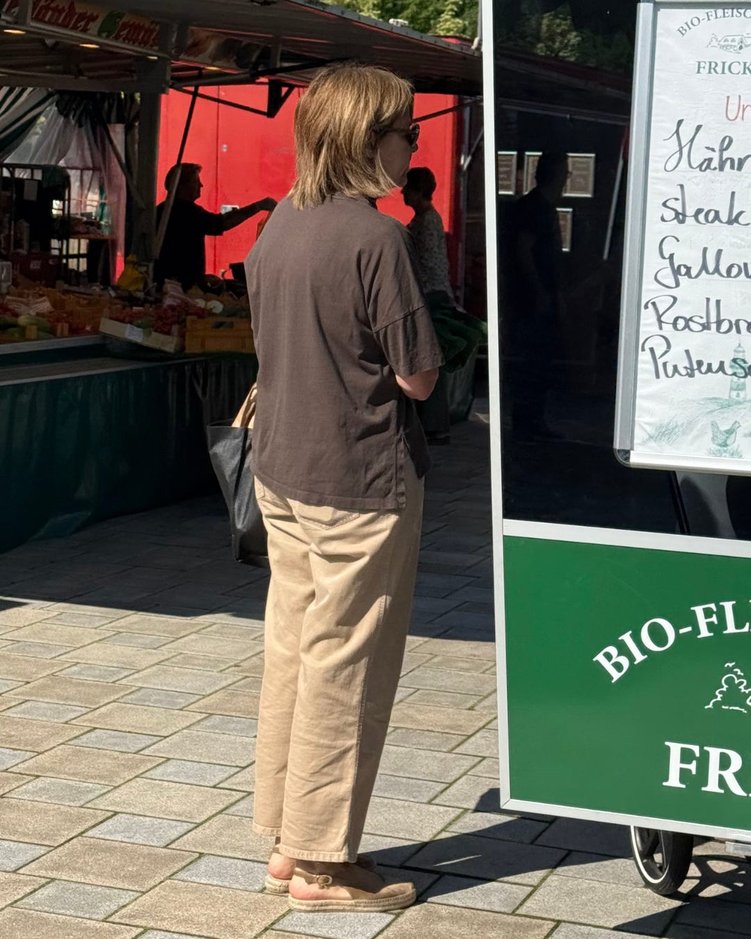
Neutrals lovers. She is the grounding person in a sea of bright colors. A brown t-shirt from Loewe (sold out, but if you’re curious) and shoes you can get on NAP. I can recognize those things haha.
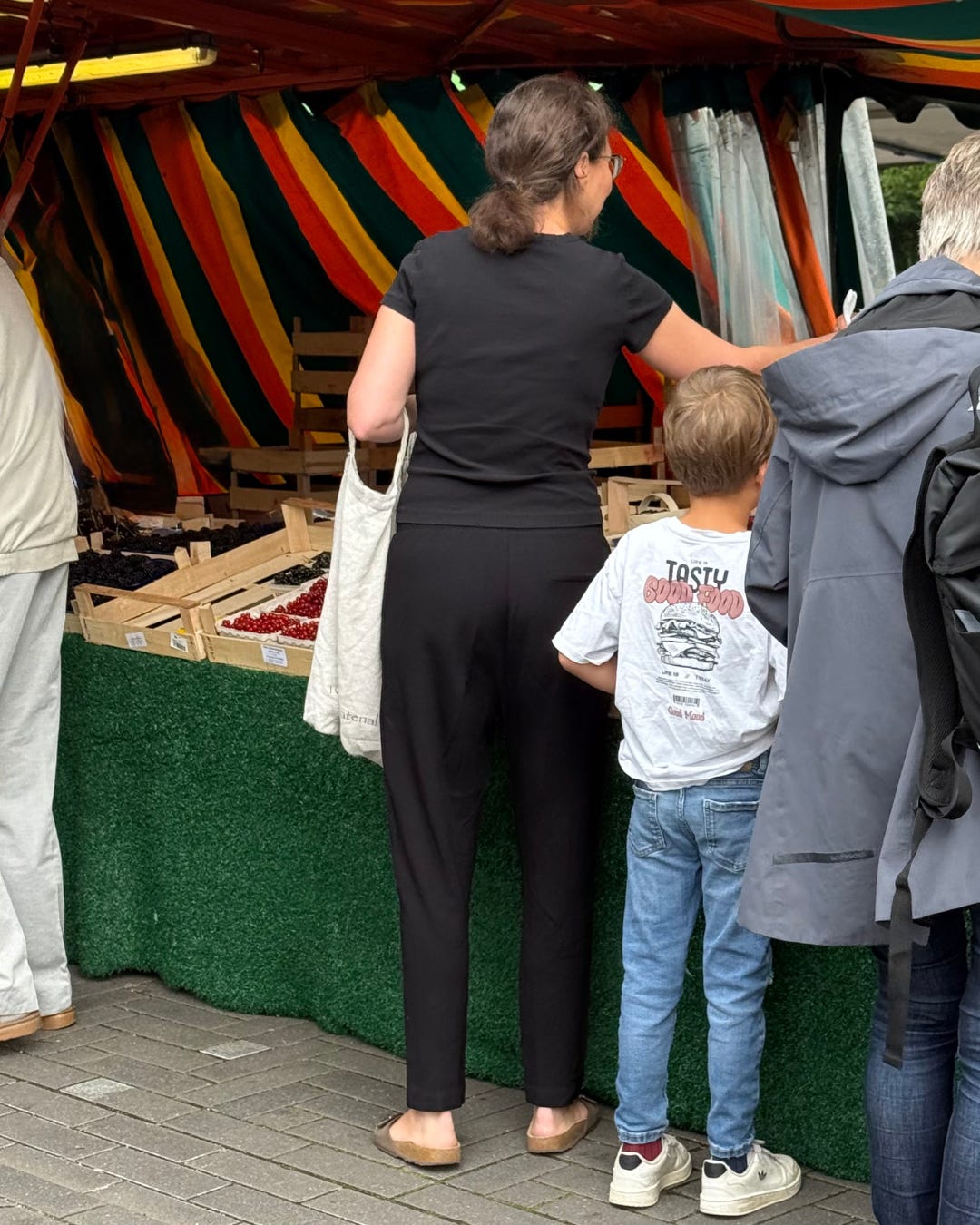
The only all black base I noticed, and I appreciate a baby black tee and relaxed black trousers. Bonus appreciation for the boy’s graphic tee and his socks, one red, one blue, that’s creative.
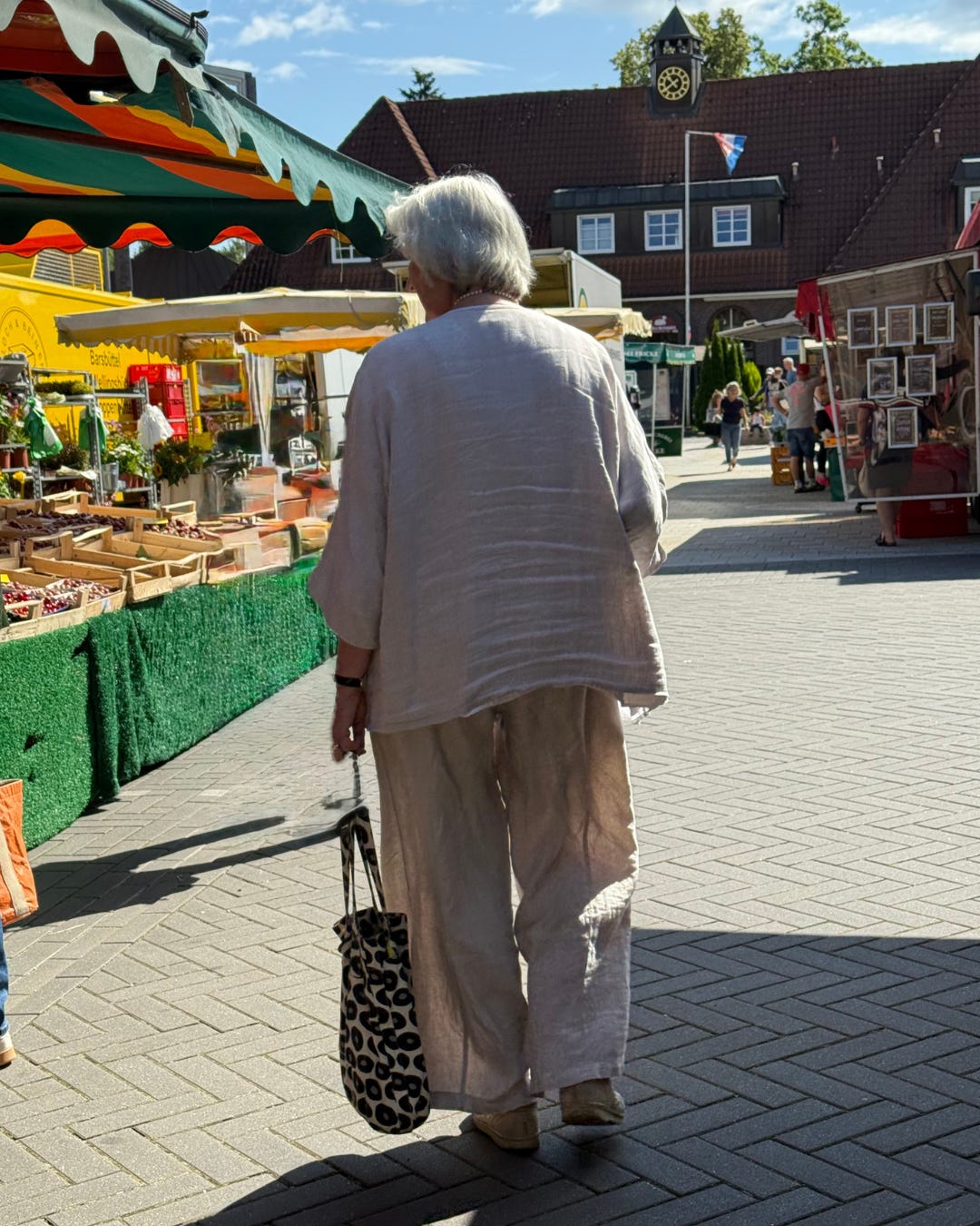
Here in the full linen set, I appreciate the more oversized silhouette, it gives a lot of chill, and I think it’s quite appropriate on a farmers’ market day. I think I can’t take that many bright colors all at once!
If you’re still here, thank you. This is your sign to like ❤️ or restack this post with your own comments! It helps this publication more than you can even imagine! Feel free to scroll back up to the Style Edits: now that you’ve seen the street style, notice how they might make even more sense!
created to understand the vibe of a specific location (a great tool for packing). It inspired me to look at a familiar place with new eyes and I discovered this micro-vibe happening locally twice a week…
My hope, in writing this extra-long letter, is that you too begin to see your familiar environment with fresh eyes — and learn to notice what only the human eye can truly perceive: details, depth, nuance, care, and the exceptions to the rule.
Love this! As someone leaning into pragmatism for my real life in a Swedish town, this was thought provoking. How to feel appropriate to your surroundings.


I love this post Ardas :)
Love this! As someone leaning into pragmatism for my real life in a Swedish town, this was thought provoking. How to feel appropriate to your surroundings.